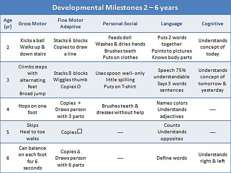
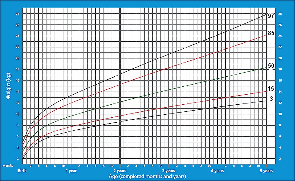
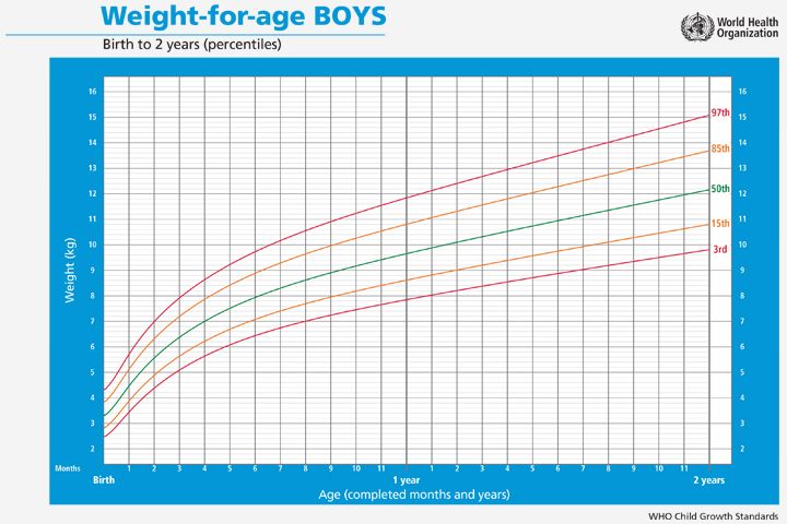
Who growth chart 0 5 years
Weight Age WHO 0-5 Year
Weight Age 0-5 Height Age 2-5 Weight Height 2-5 Head Circum 0-5
Was this useful to you? Help others and share.
Description:
This app uses WHO tables and data for weight for age calculations. The calculator is valid for babies, infants, toddlers and preschoolers with an age range of birth to five years.
This calculator provides your child's weight percentile based on age. The percentile shows how your child's weight compares to other children. The percentile tells you what percentage of babies weigh less than your child. For example out of a sample of 100 babies, a percentile value of 40 percent means your child weighs more than 40 babies and weighs less than the other 60 babies.
A percentile of 50% represents the average or mean weight. A value below 50 percent means a child weighs less than the average. A value greater than 50 percent means a child is above average. This does not mean your child is overweight or underweight. A doctor or physician should be consulted to determine weight status.
Calculation Instructions:
- Select Gender - Choose male for boys and female for girls.
- Enter Birthday - Day of birth
- Enter Measurement Date - Enter the day the measurement was taken.
- Enter Weight - The mass of child
- Select Units
-
- kg - Metric kilogram
- lb - Standard US pound
Outputs:
- Percentile - The weight percentile of the child.
- Age - The age of the child in months
- Weight - The mass of the child in metric and standard units.
- Graph Plot - Weight versus age graph with 5, 10, 25, 50, 75, 95 and calculated percentile lines.
Reference:
"The WHO Child Growth Standards". The World Health Organization. https://www.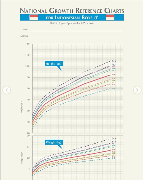 who.int/toolkits/child-growth-standards/standards.
Child Height Predictor:
Child Height Predictor - Predict Adult Height
CDC Recommended Growth Charts:
The United States Center for Disease Control (CDC) recommends using the World Health Organization (WHO) charts for the first two year of life (0 to 2 years). After two years, it is recommended to return to the CDC charts.
Weight-Age (WHO 0-2 years) Length-Age (WHO 0-2 years) Weight-Length (WHO 0-2 years) Head Circumference-Age (WHO 0-2 years)
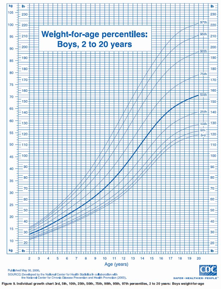
Weight-Age (CDC 2-20 Years) Stature-Age (CDC 2-20 Years) Weight-Stature (CDC 2-20 Years)
CDC Growth Charts:
Weight-Age (CDC 0-3 years) Length-Age (CDC 0-3 years) Weight-Length (CDC 0-3 years) Head Circumference-Age (CDC 0-3 years) Weight-Age (CDC 2-20 Years) Stature-Age (CDC 2-20 Years) Weight-Stature (CDC 2-20 Years)
WHO Growth Charts:
Weight-Age (WHO 0-5 years) Length-Age (WHO 0-2 years) Height-Age (WHO 2-5 years) Weight-Length (WHO 0-2 years) Weight-Height (WHO 2-5 years) Head Circumference-Age (WHO 0-5 years)
Chinese Growth Charts:
Weight-Age (China 0-18 years) Length-Age (China 0-3 years) Height-Age (China 3-18 years) Head Circumference-Age (China 0-6 years) Weight-Length (China 0-3 years) Weight-Height (China 3-18 years)
Preterm Infant Growth Charts:
Weight-Age (23-41 Gestational Weeks) Length-Age (23-41 Gestational Weeks) Head Circumference-Age (23-41 Gestational)
Email Contact and Privacy Policy:
Contact: aj@ajdesigner.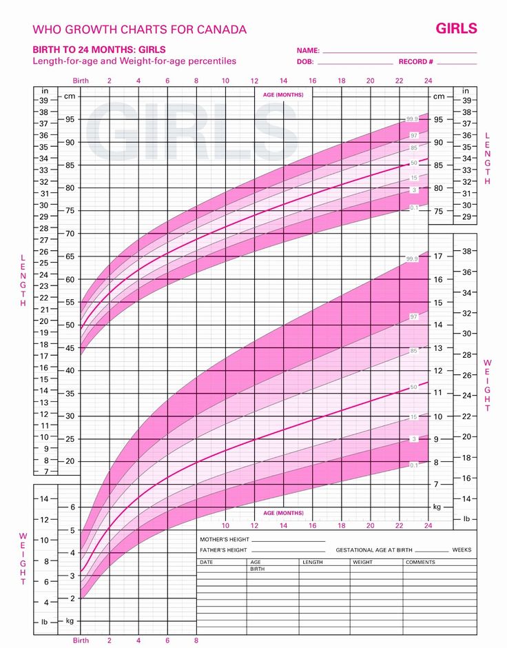 com
Privacy Policy - Legal Disclaimer
com
Privacy Policy - Legal Disclaimer
Popular Pages:
Sale Discount Calculator - Percent Off Loan Calculator Mortgage Extra Payment Paycheck Overtime Rate Calculator Jobs Salary Pay Check Converter Temperature Converter Fraction Calculator - Simplify Reduce Engine Motor Horsepower Calculator Earned Value Project Management Present Worth Calculator - Finance Constant Acceleration Motion Physics Statistics Equations Formulas Mortgage Loan Calculator - Finance Weight Loss Diet Calculator Body Mass Index BMI Calculator Light Bulb Energy Cost Analysis Automobile Fuel Economy - Gasoline Tire Size Comparison Calculator Water Pump Calculator - Hydraulics Geometry Square Circle Cylinder Triangle Calculator Torque Calculator Density Calculator Pressure Calculator Power Calculator Force Calculator
Disclaimer:
Use this calculator at your own risk. This calculator may or may not be accurate or reliable. By using this calculator you acknowledge any reliance on this calculator shall be at your sole risk.
AJ Design Software:
Technical Tools, Specifications, How to Guides, Training, Applications, Examples, Tutorials, Reviews, Answers, Test Review Resources, Analysis, Homework Solutions, Help, Data and Information for Engineers, Technicians, Teachers, Tutors, Researchers, K-12 Education, College and High School Students, Science Fair Projects and Scientists
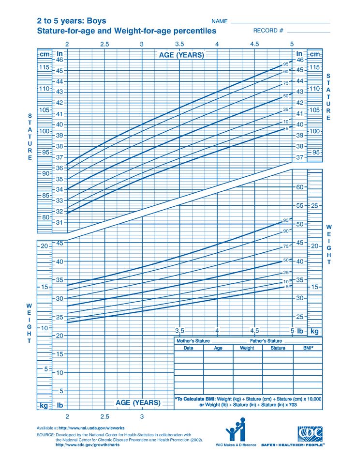
Height Age WHO 2-5 Year
Weight Age 0-5 Height Age 2-5 Weight Height 2-5 Head Circum 0-5
Was this useful to you? Help others and share.
Description:
This app uses WHO tables and data for height for age calculations. The calculator is valid for children, toddlers and preschoolers with an age range of two to five years.
This calculator provides your child's height percentile based on age.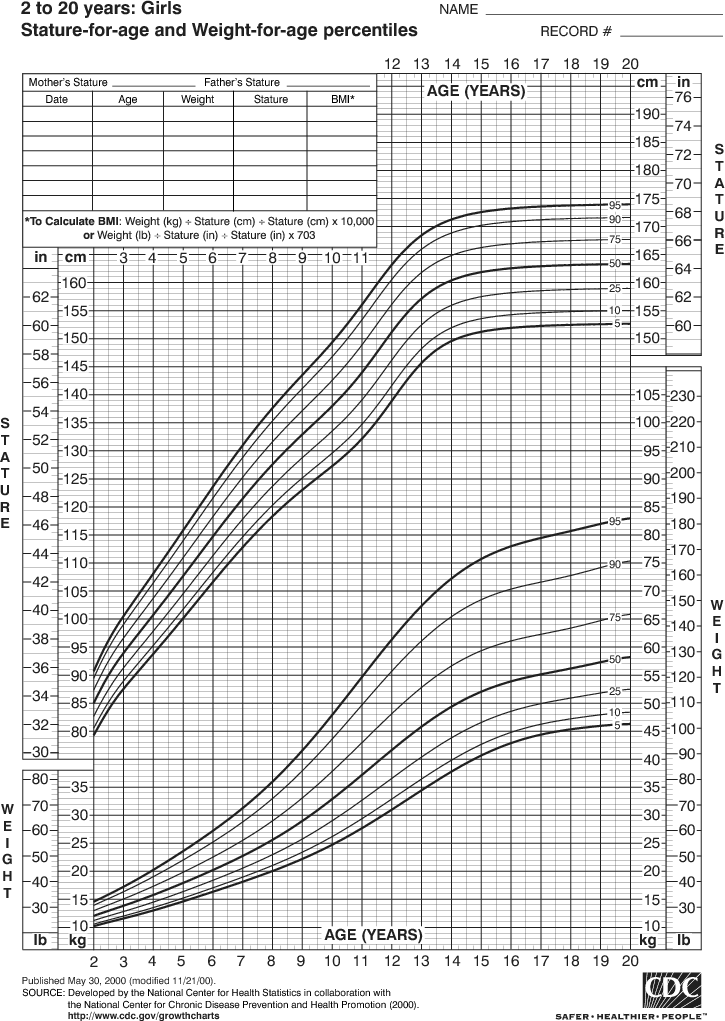 The percentile shows how your child's height compares to other children. The percentile tells you what percentage of babies who are shorter than your child. For example out of a sample of 100 babies, a percentile value of 40 percent means your child is longer than more than 40 babies and shorter than the other 60 babies.
A percentile of 50% represents the average or mean weight. A value below 50 percent means a child is shorter than average. A value greater than 50 percent means a child is above average. A doctor or physician should be consulted to determine growth status.
Calculation Instructions:
- Select Gender - Choose male for boys and female for girls.
- Enter Birthday - Day of birth
- Enter Measurement Date - Enter the day the measurement was taken.
- Enter Height - The laying down distance of the child
- Select Units
-
- cm - Metric centimeters
- in - Standard inch
Outputs:
- Percentile - The length percentile of the child.
- Age - The age of the child in months
- Height - The standing length of the child in metric and standard units.
- Graph Plot - Height versus Age graph with 5, 10, 25, 50, 75, 95 and calculated percentile lines.
Reference:
"The WHO Child Growth Standards". The World Health Organization. https://www.who.int/toolkits/child-growth-standards/standards.
Child Height Predictor:
Child Height Predictor - Predict Adult Height
CDC Recommended Growth Charts:
The United States Center for Disease Control (CDC) recommends using the World Health Organization (WHO) charts for the first two year of life (0 to 2 years). After two years, it is recommended to return to the CDC charts.
Weight-Age (WHO 0-2 years) Length-Age (WHO 0-2 years) Weight-Length (WHO 0-2 years) Head Circumference-Age (WHO 0-2 years)
Weight-Age (CDC 2-20 Years) Stature-Age (CDC 2-20 Years) Weight-Stature (CDC 2-20 Years)
CDC Growth Charts:
Weight-Age (CDC 0-3 years) Length-Age (CDC 0-3 years) Weight-Length (CDC 0-3 years) Head Circumference-Age (CDC 0-3 years) Weight-Age (CDC 2-20 Years) Stature-Age (CDC 2-20 Years) Weight-Stature (CDC 2-20 Years)
WHO Growth Charts:
Weight-Age (WHO 0-5 years) Length-Age (WHO 0-2 years) Height-Age (WHO 2-5 years) Weight-Length (WHO 0-2 years) Weight-Height (WHO 2-5 years) Head Circumference-Age (WHO 0-5 years)
Chinese Growth Charts:
Weight-Age (China 0-18 years) Length-Age (China 0-3 years) Height-Age (China 3-18 years) Head Circumference-Age (China 0-6 years) Weight-Length (China 0-3 years) Weight-Height (China 3-18 years)
Preterm Infant Growth Charts:
Weight-Age (23-41 Gestational Weeks) Length-Age (23-41 Gestational Weeks) Head Circumference-Age (23-41 Gestational)
Email Contact and Privacy Policy:
Contact: aj@ajdesigner. com
Privacy Policy - Legal Disclaimer
com
Privacy Policy - Legal Disclaimer
Popular Pages:
Sale Discount Calculator - Percent Off Loan Calculator Mortgage Extra Payment Paycheck Overtime Rate Calculator Jobs Salary Pay Check Converter Temperature Converter Fraction Calculator - Simplify Reduce Engine Motor Horsepower Calculator Earned Value Project Management Present Worth Calculator - Finance Constant Acceleration Motion Physics Statistics Equations Formulas Mortgage Loan Calculator - Finance Weight Loss Diet Calculator Body Mass Index BMI Calculator Light Bulb Energy Cost Analysis Automobile Fuel Economy - Gasoline Tire Size Comparison Calculator Water Pump Calculator - Hydraulics Geometry Square Circle Cylinder Triangle Calculator Torque Calculator Density Calculator Pressure Calculator Power Calculator Force Calculator
Disclaimer:
Use this calculator at your own risk.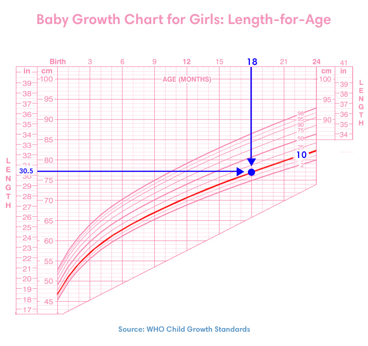 This calculator may or may not be accurate or reliable. By using this calculator you acknowledge any reliance on this calculator shall be at your sole risk.
AJ Design Software:
Technical Tools, Specifications, How to Guides, Training, Applications, Examples, Tutorials, Reviews, Answers, Test Review Resources, Analysis, Homework Solutions, Help, Data and Information for Engineers, Technicians, Teachers, Tutors, Researchers, K-12 Education, College and High School Students, Science Fair Projects and Scientists
how to choose the right chart or graph for an annual report
The target audience of your presentation or report - investors, management and just people - expects to receive not a bunch of numbers, but already formulated conclusions or clearly placed accents. There is a need to draw the attention of the audience to factors and circumstances, to show plans and strategies.
Graphic display of information helps convey the right idea, reinforce the formulated conclusion or emphasize the emphasis
But there is one problem - the perception of positive and negative results. At the same time, different audiences have different attitudes even to positive ones. For example, journalists may be skeptical about achievements. Shareholders tend to react painfully to losses. And here a subtle thoughtful approach is needed.
You can talk about failures and negativity in a very boring and tedious way, but an interesting and peppy story about successes can be backed up with a visual demonstration, including a presentation with impressive graphs. At the same time, a correctly chosen diagram can radically change the perception of information: if you simply show how the company's income grew during the year, it will not be as impressive as if your competitor's subsidence dynamics is shown nearby.
One of the difficulties that significantly slows down reporting and analysis work is choosing the right type of chart. Choosing it incorrectly can cause confusion in the minds of the viewers or lead to an erroneous interpretation of the data.
Let's look at an infographic on the world's butter production.
Top Lead infographic for Baker Tilly. View in full size.
Everything is here - production volumes, exports, forecasts, demand, consumers and tons of information. This infographic contains what is essentially a huge amount of data on an entire industry. Nevertheless, it is easy to understand, and certain trends are clearly visible on the chart.
To create a chart that explains and demonstrates accurate analytics, you first need to understand why you might need them at all. In this article, we'll look at five questions that come up when choosing a chart type. Then we will give an overview of 13 different types of diagrams, from which you can choose the most suitable one.
5 questions to ask yourself when choosing a chart
1. Do you need to compare values?
Graphs are ideal for comparing one or more sets of values, and they can easily display the lowest and highest readings.
To create a comparison chart, use the following types: bar chart, pie chart, scatter chart, scale with values.
2. Do you want to show the structure of something?
For example, you might want to talk about the types of mobile devices your site visitors use or your total sales broken down into segments.
Use the following charts to show structure: Pie, Stacked Bar, Vertical Stack, Area, Waterfall.
3. Do you want to understand how data is distributed?
Distribution tables help you understand key trends and point out what is out of line.
Use these charts: scatter plot, line chart, histogram.
4. Are you interested in analyzing trends in a particular set of data?
If you want to know more about how numbers behave over a particular time period, there are chart types that show this very well.
You will need: line chart, dual axis (bar and line), histogram.
5. Want to better understand the relationship between setpoints?
Relationship graphs are suitable for showing how one variable relates to another or to several different variables. This can be used to show positive, negative, or zero impact on another digit.
Use the following charts for this: scatter chart, bubble chart, line chart.
13 different chart types for analyzing and presenting data
To better understand each chart and its uses, let's take a look at each chart type.
Histogram
The histogram is used to show comparison between different items, also it can compare items over a certain period of time. This format can be used to track the dynamics of transitions to a landing page or the number of customers over a certain period.
Top Lead Infographic for AEQUO Law Firm
Bar Chart Design Guidelines
.
2. Use horizontal marks to improve readability.
3. Start the y-axis at 0 to correctly plot the values.
Horizontal bar chart
A bar chart—mostly a horizontal bar chart—should be used to avoid confusion when one data bar is too long or when comparing more than 10 items.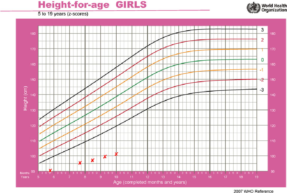 This option can also be used to visualize negative values.
Top Lead infographic for Aggeek online publication. View in full size.
Bar chart design guidelines
1. Use a consistent color scheme and color in areas you want to highlight as significant breakpoints or changes over time.
2. Use horizontal marks to improve readability.
3. Start the y-axis at 0 to correctly plot the values.
Line chart
The line chart shows trends or progress and can be used to visualize a wide variety of data categories. It should be used when you are creating a graph based on long-term data collection.
Top Lead infographic. The line chart is at the bottom.
Line Chart Design Guidelines
1. Use solid lines.
2. Do not draw more than four lines to avoid visual distractions.
3. Use the correct height so that the lines take up approximately 2/3 of the height of the Y axis.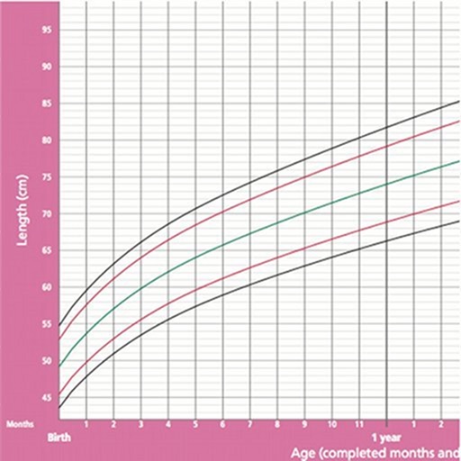
Dual axis chart
which, for example, is data for a period, and the other is better suited for grouping by category. Thus, it is possible to demonstrate the correlation or its absence between different indicators.
Top Lead infographic for Growth Up. The chart with the dual axis is at the top.
Design Guidelines for Dual Axis Charts
1. Use the left y-axis for the primary variable because it is natural for people to look to the left first.
2. Use different plot styles to illustrate the two datasets.
3. Select contrasting colors for the compared datasets.
Area chart
The area chart generally looks like a line chart, but the space between the x-axis and the plot line is filled with color or a graphic. This option is suitable for demonstrating the relationship between parts of a whole, for example, the contribution of individual sales representatives to the total sales for the year. This will help analyze both the whole picture as a whole and information about trends in individual areas.
Top Lead infographic for Baker Tilly. From top to bottom: pie chart, two area charts, pie charts.
Design guidelines for area charts
1. Use translucent colors.
2. Use no more than four categories to avoid confusion.
3. Organize data with a high frequency of variability at the top of the chart to make it easier to perceive dynamic changes.
Stack Chart
It can be used to compare a large number of different components. For example, the frequency of visiting several sites and each page individually.
Infographics and layout — Top Lead. For Naftogaz of Ukraine. Stacked chart - bottom left. View in full size.
Design Guidelines for Stacked Charts
1. It is best used to illustrate part-whole relationships.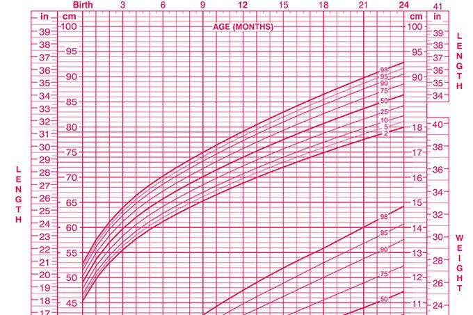 For greater clarity, choose contrasting colors.
2. Zoom in on the chart large enough to see the size of the groups in relation to each other.
Pie Chart
A pie chart shows a static number and how parts add up to a whole - the composition of something. The pie chart shows the numbers as a percentage and the sum of all segments should add up to 100%.
Infographics and layout — Top Lead. For Naftogaz of Ukraine. View in full size.
Design Guidelines for Pie Charts
1. Do not add too many categories so that the difference between the slices is clearly visible.
2. Check that the total sum of all parts is 100%.
3. Arrange the pieces according to their size.
Top Lead infographic for Baker Tilly. View in full size.
Waterfall
A waterfall is used to show how intermediate values - positive and negative - affect the initial value and lead to the final result.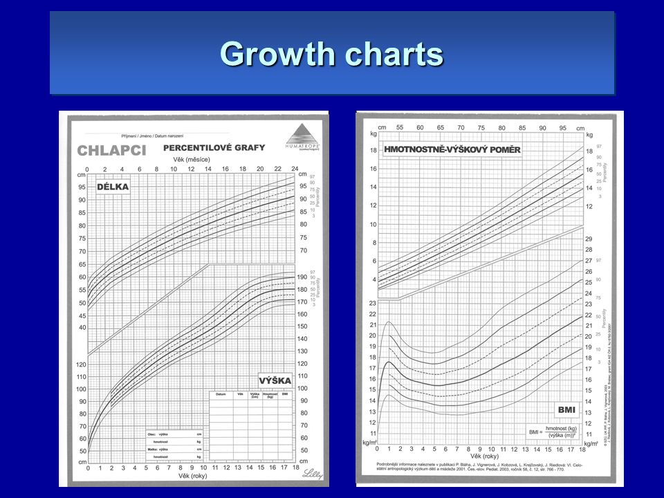 An example would be to visualize how a company's total revenue depends on different departments and translates into a specific amount of profit.
Infographics and layout — Top Lead. Annual report "Naftogaz of Ukraine". Waterfall chart in the top half of the layout. View in full size.
Design Guidelines for Waterfall Charts
1. Use contrasting colors to highlight differences in datasets.
2. Choose warm colors to show growth and cool colors to show falling.
Funnel
A funnel chart shows the sequence of stages and the speed at which each stage is completed. It can be used to track the sales process or user interaction with the site.
Top Lead infographic.
Funnel Chart Design Guidelines
1. Scale the size of each section to accurately represent the size of the data set.
2. Use contrasting colors or shades of the same color from darkest to lightest as the funnel narrows.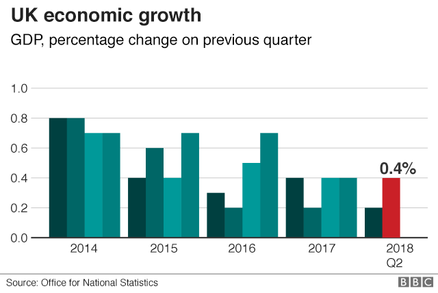
There are several other types of charts - they are not used so often, but can also be useful for visualizing large amounts of data. Among them:
Scatter plot
Scatter plot shows the relationship between two different variables or shows distributional trends. It is suitable if you have a lot of different point data and want to find common ground in the dataset. This visualization works well in finding exceptions or patterns in the distribution of data.
Design guidelines for scatter plots
1. Include more variables such as different sizes to combine more data.
2. Start the y-axis at 0 for accurate data distribution.
3. If you are using trend lines, you must limit yourself to two to make the graph clear.
Bubble chart
A bubble chart is similar to a scatter chart. But only in the sense that it can show distribution and interconnection. There is a third set of data, which is denoted by the size of the circle.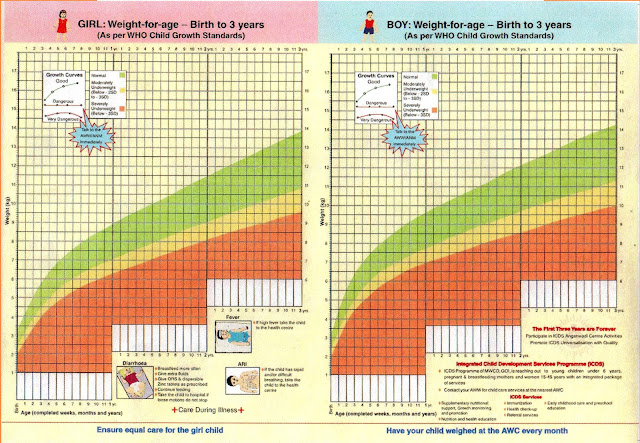
Design Guidelines for Bubble Charts
1. Grade bubbles by area, not diameter.
2. Make sure the marks are clear and visible.
3. Use only circles.
Scale with values
This graph shows the progress towards the goal, compares it according to different criteria and displays the result as a rating or performance.
Design Guidelines for Scale with 9 Values0006
1. Use contrasting colors to show momentum.
2. Use one color in different shades to measure progress.
Heatmap
A heatmap shows the relationship between two elements and provides rating information. Rating information is displayed using different colors or different saturation.
Heatmap Design Guidelines
1. Use a basic and clear map layout so as not to distract viewers from the data.
2. Use different shades of the same color to show the change.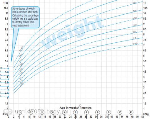
3. Avoid using multiple templates.
Design options can be huge.
To learn more about preparing non-financial reports and listen to case studies from companies such as Coca-Cola, Kernel, Nova Poshta, 1+1 Media, Infopulse and others, register for our online Corporate Reporting Conference 2020. Click on the banner to find out details, and buy tickets directly on Facebook:
Size Chart
Women
| Bust | 84 | 88 | 92 | 96 | 100 | 104 | 108 | 112 | 116 |
| Hips | 90 | 94 | 98 | 102 | 106 | 110 | 114 | 118 | 122 |
| International designation | XS | S | M | L | XL | XXL | XXXL | 4XL | 5XL |
Men
| Bust | 88 | 92 | 96 | 100 | 104 | 108 | 112 | 116 |
| Waist | 78 | 82 | 86 | 90 | 94 | 98 | 102 | 106 |
| International designation | XS | S | M | L | L | XL | XXL | XXXL |
Child
| newborns | ||
| 0/3 | 0-3 months | up to 61 cm |
| 3/6 | 3-6 months | up to 66 cm |
| 0/5 | 6-9 months | up to 71 cm |
| up to two years | ||
| s | 6-9 months | up to 71 cm |
| m | 6-12 months | up to 77 cm |
| l | 12-18 months | up to 81 cm |
| xl | 18-24 months | up to 86 cm |
| 2 to 7 years | ||
| 2T/2 | 2 years | up to 90 cm |
| 3T/3 | 3 years | up to 98 cm |
| 4T/4 | 4 years | up to 105 cm |
| 5 | 5 years | up to 113 cm |
| 6 | 6 years | up to 120 cm |
| 7 (boy), 6x (girl) | 7 years | up to 128 cm |
Boys 8 to 15 years old
| 8 (S) | 7 | up to 127 cm |
| 10 (S) | 7-8 | up to 137 cm |
| 12 (M) | 9-10 | up to 147 cm |
| 14 (M) | 11-12 | up to 154 cm |
| 16 (L) | 12-13 | up to 162 cm |
| 18 (L) | 13-14 | up to 167 cm |
| 20 (XL) | 14-15 | up to 173 cm |
Girls 8 to 13
| 7 (S) | 7 | up to 129. |
| 8(S) | 7-8 | up to 134.5 cm |
| 10 (M) | 8 | up to 139.5 cm |
| 12 (L) | 9-10 | up to 146 cm |
| 14 (L) | 11-12 | up to 152. |
| 16 (XL) | 12-13 | up to 158.5 cm |
 5 cm
5 cm  5 cm
5 cm When choosing belt products for men and women, we recommend using the following size matching tables:
Men's knitwear
| Underpants, pajama pants, briefs | 74 | 42 |
| 78.82 | 44. | |
| 86.90 | 48.50 | |
| 94.98 | 52.54 | |
| 102.106 | 56.58 | |
| 110.114 | 60.62 | |
| 118.122 | 64.66 | |
| 132.136 | 68. | |
| 140.144 | 72.74 | |
| 148.152 | 76.78 | |
| Shorts, trousers (including sportswear) | 74 | 42 |
| 78 | 44 | |
| 82 | 46 | |
| 86 | 48 | |
| 90 | 50 | |
| 94 | 52 | |
| 98 | 54 | |
| 102 | 56 | |
| 106 | 58 | |
| 110 | 60 | |
| 114 | 62 | |
| 118 | 64 | |
| 122 | 66 | |
| 132 | 68 | |
| 136 | 70 | |
| 140 | 72 | |
| 144 | 74 | |
| 148 | 76 | |
| 152 | 78 |
 46
46 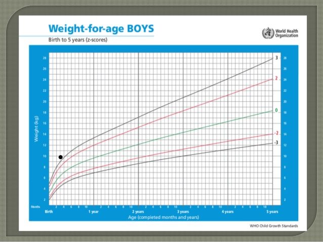 70
70 Women's knitwear
| Briefs, pantaloons, pajama trousers, skirt, shorts, skirt-shorts, trousers, skirt-trousers, leggings, capris, leggings | 86 | 40 |
| 90 | 42 | |
| 94 | 44 | |
| 98 | 46 | |
| 102 | 48 | |
| 106 | 50 | |
| 110 | 52 | |
| 114 | 54 | |
| 118 | 56 | |
| 122 | 58 | |
| 126 | 60 | |
| 130 | 62 | |
| 134 | 64 | |
| 138 | 66 | |
| 142 | 68 | |
| 146 | 70 | |
| 150 | 72 | |
| 154 | 74 | |
| 158 | 76 | |
| 162 | 78 |
When choosing products for children, we recommend the following information:
Underwear for newborns and toddlers
| Height/bust | 56-36 | 62-40 | 68-44 | 74-48 | 80-52 | 92-56 |
Boys' briefs, girls' briefs and knickers
| Bust | 40 | 44 | 48 | 52 | 56 | 60 | 64 | 68 | 72 | 76 | 80 | 84 |
Girls' knitted underwear
| Size | 40 | 44 | 48 | 52 | 52 | 56 | 60 |
| Height/bust |
|
| 74. | 74.80-52 | 98-52 | 98.104-56 | 110.116-60 |
| Size | 64 | 68 | 72 |
| 76 | 80 | 84 |
| Height/bust | 122. | 128-68 134.140-68 | 134.140-72 146.152-72 |
| 146-76 152-76 | 152-80 158.164-80 | 158.164-84 |
 80-48
80-48  128-64
 Girls' outerwear
| Size | 40 | 44 | 48 | 52 | 52 | 56 | 60 |
| Height/bust | 62-40 | 68-44 | 74. | 74.80-52 | 98-52 | 98.104-56 | 110.116-60 |
| Size | 64 | 68 | 72 |
| 76 | 80 | 84 |
| Height/bust | 122. | 128-68 134.140-68 | 134.140-72 146.152-72 |
| 146-76 152-76 | 152-80 158.164-80 | 158.164-84 |
 80-48
80-48  128-64
 Boys' knitted underwear
| Size | 40 | 44 | 48 | 52 | 52 | 56 | 60 |
| Height/bust | 62-40 | 68. | 80.86-48 | 80.86-52 | 92.98-52 | 98.104-56 | 110.116-60 |
| Size | 64 | 68 | 72 |
| 76 | 80 | 84 |
| Height/bust | 122. | 128-68 134.140-68 | 134.140-72 146-72 |
| 146-76 152-76 | 152-80 158.164-80 | 158.164-84 |
 74-44
74-44  128-64
 Boys' outerwear
| Size | 40 | 44 | 48 | 52 | 52 | 56 | 60 | |||
| Height/bust | 62-40
| 68-44 74. | 80-48 | 80-52 | 98-52 | 98.104-56 | 110.116-60 | |||
| Size | 64 | 68 | 72 |
| 76 | 80 | 84 | |||
| Height/bust | 122. Welcome
Find us on iTunes! | |||||||||
 80-44
80-44